For the last couple of weeks I’ve been working on producing a seascape. I’ve done my share of seascapes in the past, usually from photographic references, but this one is different. And I’m going to take my readers along for the ride… so I hope it works.
My aim here is to produce a piece of art that uses foundational concepts of design in a way that just happens to be a seascape. This happens in all successful paintings but it is often done intuitively. In developing this painting, I’m looking at tonal masses, lead-ins, temperature contrasts and edges and bringing them together to create a “big picture” view, rather than a detailed analysis of water and rocks.
In order to do this, I’ve looked at a lot of seascapes by other artists including legends like Frederick Waugh and E. John Robinson. I’ve had Robinson’s book on seascapes in oils and two of his videos for quite some years. I’ve stared at the paintings, turned them upside-down and converted them to greyscale and tonal images in an effort to look through the wonderful seascape paintings we see at first view to the foundations below. It’s like going back to school except I’m the teacher and the student.
It’s still winter down here and we’ve “enjoyed” some cold, wet weather, but I’ve spent many hours down at the coast watching, photographing and videoing waves, large and small. I’ve climbed rocks, wandered through sand dunes and walked along secluded and desolate beaches. I’ve been rained on and covered in sea spray and witnessed some beautifully atmospheric light. It’s tough work, but someone has to do it.
I’ve done all this to really get a feeling for the ocean, especially where it meets the shore. I hope to do a lot more of it too, because the ocean is a complex and mysterious beast. But, for now, I’m directing my recent experience into a painting.
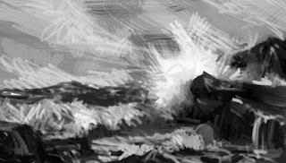
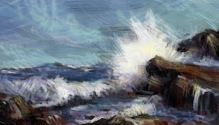
I began by doing a digital painting in Photoshop making a simple abstract shape in three grey tones. Then I looked at how I could turn it into a seascape of sorts. Once I had something with potential, I added colour over the top.
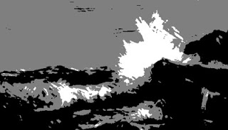
I was exploiting directional lines and tonal contrast to make an obvious focal point. The tonal map, above, shows that the painting is made up mostly of middle tones. The dark masses take up less space and the lights take up the least. The strongest contrast, where the darkest and lightest values meet, is right at the focal point.
I also introduced a burnt orange into the rocks to contrast against the cool blue colour scheme. Blue and orange are complementary colours so when they are brought together, each one enhances the other. A small area of complementary colour will generally attract the eye and, again, I’ve used this mainly at the focal point.
Though it was never intended to be anything more than a very rough sketch, this little painting was pushed and pulled and even turned upside-down occasionally to see how it was holding together. This was all done without any reference so I could focus solely on designing an interesting pattern rather than slavishly copying an actual scene.
It’s not perfect but it’ll do for my purposes.
I’ll post part two soon.
Seascape oil painting series:
Genesis of a seascape in oil – I
Genesis of a seascape in oil – II
Genesis of a seascape in oil – III
Evolution of a seascape in oil – IV
Evolution of a seascape in oil – V
Evolution of a seascape in oil – VI


