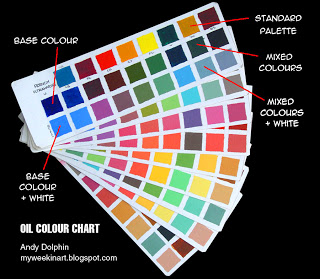
Soon after taking up oil painting I made a colour chart showing basic two-colour combinations of the standard palette I’d adopted. This has proved invaluable when working on site or from photos – some combinations are surprising! I use a shorthand notation to identify colours on sketches.
To make the charts I first drew a pencil grid on an A2 sheet of textured oil painting paper and made a chart for each colour. I cut the finished sheet into separate pages to make the booklet you see above.
The base colour for each chart is on the far left and below this is that base colour mixed approximately 50/50 with titanium white.
Across the top is each other colour in my standard palette. Below these is a 50/50 mix of each of these colours with the base colour for each chart. Below this is that combined colour mixed 50/50 with titanium white.
If you make a chart like this, take note that each mixture is used twice. For example, a mixture of cerulean blue and cadmium scarlet will appear on both the cerulean and scarlet charts. If you keep this in mind, you’ll get the job done in almost half the time! It only took a couple of hours, as I recall.
I used a small palette knife to mix the colours as it was much easier to measure even amounts of paint. I used a small square brush to apply the paint. Be careful to keep your brush clean.
I have since seen charts that take this idea much further, mixing varying amounts of each pair of colours and then each resultant colour is tinted with with increasing amounts of white for a very wide range of combinations.
My standard palette:
- French Ultramarine
- Cerulean Blue
- Cadmium Yellow Deep
- Cadmium Yellow Light
- Cadmium Scarlet
- Permanent Crimson
- Viridian Green
- Yellow Ochre
- Burnt Sienna
- Titanium White

